Monday, March 31, 2014

Returning to my (Embroidery) Roots

I recently read somewhere that those things you loved to do when you were a kid are probably hints of what you love to do as an adult.  I have found this to be more than true!

So, what did I like as a kid?  I loved playing post office and collecting labels and stamps.  These things have manifested themselves into my first medium of collage (and you can find much of my collage work on my other blog, Ephemeraology!).  I also loved to do cross-stitch patterns, and spent hours with my Fashion Plates toy (which I recently bought again on Ebay).  As a matter of fact, I was embroidering up until I discovered knitting, in 1999 (which turned into collage, in 2006).  I recently returned to embroidery for a project called The Exquisite Uterus Project, which highlights women's reproductive rights.  You can see my entry here.

I was further inspired by "Stitch", an exhibit that was recently held at our two-year state school, UW-Fond du Lac.  All of the artists were from my alma mater, UW-Green Bay!  As I saw all of their beautiful work, I began to wonder....

What would happen if I took my vintage letterpress plates and put them through my press - with fabric?

My fab friend Amy Jarvis had given me two vintage plates of very fancy ladies in furs - a PERFECT beginning.  This one in particular struck my fancy.


I attached it to a wood block to raise it to type height, mixed a creamy brown ink, and placed some linen atop the plate.  Now, the moment of truth - would my backpack press work?


SUCCESS!!!!  I am SO excited to begin embroidering/embellishing this image today!  I will post photos when it's done!

Oh my gosh - the possibilities with this press and my blocks!!  I can't wait to experiment further!  :D

P.S.  Remember when I mentioned my Fashion Plates toy in the second paragraph?  Well, I got to thinking - how would the texture side of the plates hold up under pressure?  I affixed one to a wood block, and PRESTO!!


So - what ELSE can I use?  :D

Monday, March 24, 2014

Things I Learned in Grand Marais

Hello all!

Wow, it's been a busy two weeks!  I'm finally getting caught up after being gone for four days to the Hinterland, AKA Grand Marais, Minnesota, where I took a very intense 3-day woodcut workshop at North House Folk School/Grand Marais Art Colony.  Here's what I took away from the weekend:


1.  Grand Marais is my Shangri-la.
I've always been a cold-weather person, but I never realized how much until this visit.  While my region of Wisconsin had melting snow, it showed no sign of spring in Grand Marais - quite the opposite!  It was like a friendly, beautiful, non-evil version of Narnia.  Oh, and if you're ever in Grand Marais, do yourself a favor and visit the two aforementioned places - you won't be disappointed!  I immediately felt at home in both.

2.  I really enjoy working small.
The blocks we carved in the class were 8X10" - now, for many of you, that may seem quite small.  On the contrary!  For me, it was an unwieldy size for the design I chose.  Unless my design contains oodles of tiny details, I'll stick to my 3X4" blocks.  I haven't even mentioned how much I love my Flexcut micro set of U gouges!

3.  I never knew intaglio/relief inks could be so beautiful or versatile!
We worked with Akua inks, which are INCREDIBLE.  Because I'm a beginner, I've bought a lot of Speedball inks, which have worked fine for me.  But from now on, I'll be supplementing my ink stash with Akua colors.  They're dreamy.

4.  There's just something about working with natural materials.
I've been taking lessons from Angie Zimmerman, a printmaker in Sheboygan, WI, for months now.  That's when I knew I loved working with wood.  That idea was enforced this weekend (but see #2, above).  My go-to medium is linoleum, for ease of use.  I'll save the woodcuts for special occasions.

5.  Registration is not my thang.
Or, to be more specific, I like my  way of doing it.  It's funny how one gets used to a certain way of doing something and it's hard to change.  I've always had a difficult time with drawing a straight line, even with measuring implements.  So until it no longer works for me, I'll stick with my own version.  It's a great hack.  :)

My one salvageable print from the class....I'll stick with my
own method of registration.  :) 
6.  If one is relatively new to woodcuts, one should never carve non-stop for more than 5 hours.
Yeah.  Question:  Is it normal for one's thumb and forefinger to still be numb 8 days after the workshop? I should probably get that looked at, shouldn't I.

Monday, March 10, 2014

Meeting a Printmaking Legend

A while back, I wrote a post about a book I'd found during a trip to the John Michael Kohler Arts Center in Sheboygan.  It's called Progressive Printmakers: Wisconsin Artists and the Print Renaissance.  It was co-written by a master printmaker who was also a professor of printmaking at the University of Wisconsin for many years. 
That gentleman's name is Warrington Colescott.

Little did I know when I wrote that post only six weeks ago that I would get to meet him!

Mr. Colescott was at the Museum of Wisconsin Art (or MOWA) on March 6th to give a talk about his 65+ year history with printmaking, beginning with screen printing and continuing through his love affair with etching, which comprises most of the body of his work.  He currently has a piece in the Wisconsin Artists' Biennial, a painting which is also currently on view at the MOWA.  

Ever since I read his aforementioned book, I've been a fan.  But I had no idea how clever and funny he was until he explained the thought process behind his selected works!  He had the large audience in stitches, myself and my husband Brian included.  One could almost detect a twinkle in his eye when he spoke about his prints, some of which were nearly 70 years old!

© Photo courtesy of  MOWA.  All rights reserved.


One of the brilliant MOWA staff had the presence of mind to run down to the Milwaukee Art Museum and clean them out of their stock of The Prints of Warrington Colescott: A Catalogue Raisonee, 1948-2008 by Mary Weaver Chapin.  I was one of the fortunate people who snagged a copy!  In fact, I brought my other book and had them both autographed!  


At one point there was a line of people waiting to get their books signed, including my friend Ginny (shown here), who has known Warrington for some time and owns a few of his prints as well.  It was a magical evening, and I feel so lucky to have heard him speak!  

© Photo courtesy of  MOWA.  All rights reserved.

I'm sure you're all wondering at this point, so I'll tell you - although we didn't know it on that day, my friend Ginny found out the day after that not only did we have the pleasure of Warrington's presence last Thursday, but he kindly shared the day before his 93rd birthday with us!  It may have been his birthday, but we all received the gift. 

© Photo courtesy of  MOWA.  All rights reserved.


Friday, February 28, 2014

What Makes an Edition?

One thing I'm learning about printmakers - they love a good discussion!  I belong to some very active printmaking groups on Facebook and LinkedIn, and the conversations are fantastic!  

Recently, in my "Prints and Printmaking Enthusiasts" group on LinkedIn, someone began a discussion about editions and edition varies.  She asked, "I'm sure this has been covered before but how does one number linocuts that use the same plates but in a completely different colo(u)r?"

I'm so glad this question was asked - if it hadn't been, I would've started the conversation!  As a relative "newbie" printmaker, this is one of those queries that has had me guessing for a while.  Even better - the answers were all over the place!  

A little history - according to Wikipedia (which is by no means complete, but will do for the purpose of this post), an edition is "a number of prints struck from one plate, usually at the same time. This is the meaning covered by this article. This may be a limited edition, with a fixed number of impressions produced on the understanding that no further impressions (copies) will be produced later, or an open edition limited only by the number that can be sold or produced before the plate wears. Most modern artists produce only limited editions, normally signed by the artist in pencil, and numbered as say 67/100 to show the unique number of that impression and the total edition size."

In this definition, it doesn't mention anything about the variations of an edition.  That's why the conversation over at LinkedIn has been so enlightening!  For example - this week I finished an edition of 15 from a rubber print I carved back in October.  I've been stuck with the winter "blahs" lately (we've been hit SO hard this year) that I just wanted to finish something!!  Here is what transpired:


I printed three each of the five colors and then sewed a border around each in a corresponding thread color. I kept the edition to 15, because the "block" is disintegrating and in my opinion, no longer in printable condition.  Part of the issue was the fact that I had to wipe the block after every third print, to prepare for the next color.  I probably would've been able to get far more prints from the block if I had stuck with the original color (brown), but I like giving people a variety and it was really fun to do.  :)

Now, to some purists this would NOT be an edition!  Each color would've been its own edition and should be labeled as such.  And because it's a rubber block and not wood or linoleum, and I used pigment ink, these things may also play a factor as to whether or not it's a "true" edition.  Over on LinkedIn, however, the answers would be as varied as my prints!  Some people stick to the "rules", others don't care one lick.  I guess I'm somewhere in the middle.

To my mind, at least at this stage of the game, I don't think it matters.  I am not a master printmaker (yet), and these are just fun little prints for sale.  Regardless of whether I carve my block in rubber, lino or wood (and I have done all three), I will number my editions for the amount of (good) impressions I've printed, so that the buyer knows that I only did 15 prints total (I've already retired the block for good).  My main concerns are these - whether I enjoyed creating the prints, and hoping that people like what I create.  :)


Friday, February 21, 2014

Takin' the Show on the Road!

It's the third Friday of the month, and here in Fond du Lac, Wisconsin that means....Tour the Town!  It's our monthly art walk, where businesses keep their doors open until 8 p.m. and artists can show their wares for little or no commission!  It's an event that's near and dear to my heart - I'm a charter member of the committee and everyone involved is a friend of mine.  My framer, Julie Balson, is one of the founders of the whole deal, and her store, Gallery & Frame Shop, is one of the biggest supporters.

I'm so excited to be a part of the tour tonight via the Fond du Lac Public Library, where I'm showing my "Birches in Winter" piece as part of the "Greenfire" exhibit in honor of Aldo Leopold, a conservationist and author who spent a great deal of time in Wisconsin.


My husby Brian is president of the Gottfried Prairie and Arboretum, and they're the sponsors of this nature-inspired show.  It's going to be a great time!

But this is an unusual tour for me - most of the time it's just me at a venue and because I've now got my portable press, I've been taking it with me!

Besides its affordability, the number one reason I was so taken with my S.C.O.P.E. backpack printing press is its portability.  As you may already know, it was specifically designed so that it would fit in the overhead bin on an airplane.  I haven't tried that yet, but I have taken it to two separate gallery walks.  The first one was in Oshkosh back in December, when I only had my press for about four days!

I was invited by my friend and letterpress artist Kevin Rau, who owns rauhaus design + letterpress.  His studio is in this beautiful old bank in downtown Oshkosh (which you may recognize from the Johnny Depp movie, "Public Enemies" - they filmed many scenes here!).  I set up in the lobby of the bank - it was ridiculously cold that evening, as it has been all year - but we still had some brave souls venture out!  It was so much fun, and people got to see both sides of the printing spectrum - Kevin's gorgeous vintage 1946 Chandler & Price platen press...


 .....and my awesome 2013 Craft & Concept showcard press!


Everyone who witnessed the printing on both was excited to see how each worked in their own way - the kids especially!  They're always so in awe of the "old" way to print - before computers (Imagine that!  You mean people actually had to do this by hand??! ).  :)  I had one young guy so enthralled with my press that he actually contacted me for Craft + Concept's info!

I can't wait for more people to see the wonders of portable printing!

P.S.  My wonderful husband braved the cold with me that December evening and took all of these photos.  He's the BEST.  :D

Wednesday, January 29, 2014

In Tandem


I live in Northeastern Wisconsin, in the southern Fox River valley.  It's a great place to live - close to everything, relatively safe, all four seasons represented - and LOTS of printmakers.  :)

If you're into the history of printmaking, Wisconsin is a fantastic place to start!  The University of Wisconsin has one of the best printmaking facilities in the nation, which began shortly after WWII (1946).  At that point, hardly anyone was making prints.  But it only took one professor, Alfred Sessler, to change all that.  Since then, the printmaking department at the "UW" reads like a "who's who" of notable printmakers: Warrington Colescott, William Weege and Raymond Gloeckler are just a few of the names you'll hear over and over.

But I didn't know any of this when, on a cold March day last year, my sister Jen and I visited the Chazen Museum of Art in Madison.

We were on one of our "sister days", where we take a whole day and explore one part of the city.  We always have a GREAT time, and Jen always picks such neat places to visit!  When we visit Madison, we usually take just one neighborhood - Atwood Avenue, Williamson ("Willy") Street, Monroe Street - but on this day, we began on the UW campus (of which the Chazen is a part) for the  incredible "1934: A New Deal for Artists" exhibit.  (Side note: if you're in Madison and would like to visit the Chazen, you can thank some very generous donors for making this amazing art museum FREE to the public!)

That particular exhibit was everything I hoped it would be, but then we ventured into other areas of the museum.  One part of the museum showcased prints by Judy Pfaff.  I was instantly mesmerized!!!  I read the tag to these prints and it happened to say "Courtesy of Tandem Press".  At this point, I assumed that Tandem was a publishing house, and I mentioned to Jen, "I have to find the book that was published by this "Tandem!"

But she said to me, "I think Tandem is an actual working press. In fact, I think I've been there!  Should we go and check it out?"

So, after a lovely break at this awesome coffee shop, Indie Coffee, we made the 3-mile drive to an unassuming warehouse.  When we walked in, a lovely woman with a delightful Irish brogue came up to us and asked if we'd ever been here before.  Jen said she had, but that this was my first time.  I thought that would be the end of it, and that she'd let us on our merry way, but she asked if we'd like a tour.  WOULD WE?!  But being the polite, unimposing women we are, we asked many times first if it would really be okay, since we could clearly see that they were hard at work.

So this lovely lady says, "NONSENSE! That's why we're here!"

Okay!!  So she calls over to one of the workers and says, "These ladies would like a tour."  To which he replies, "Of course!  Come on in!"

At this point, I think Jen and I were both wondering what was going on - I mean, everyone's so nice!  How could they not be totally annoyed that these two people, who just wandered in off the street, are ruining their concentration and work flow?  Well, if they were annoyed, they sure didn't show it!!  The gentleman introduced himself as 
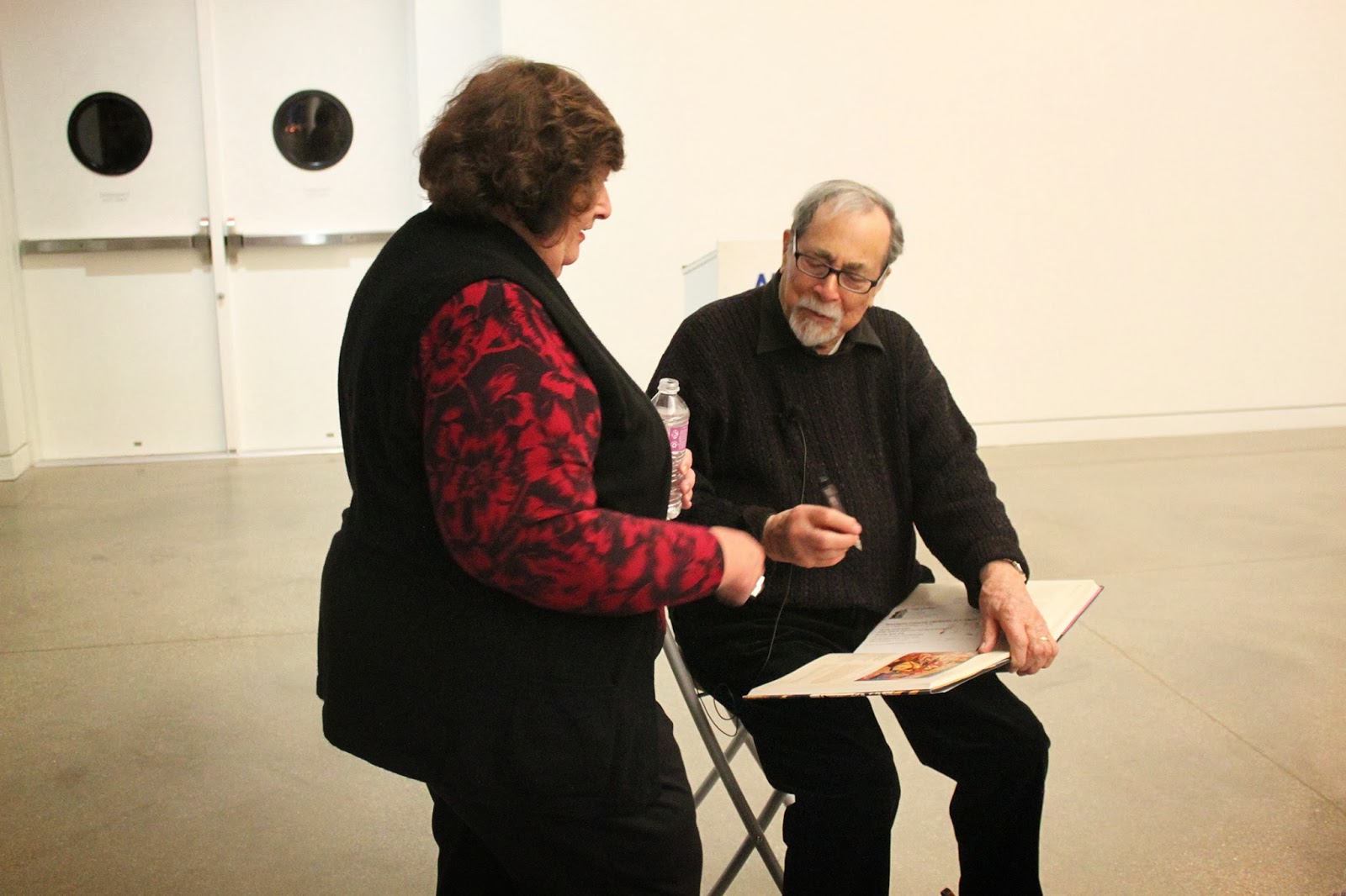
Andy Rubin, one of the master printmakers at Tandem, and that he'd been there essentially since it opened.  He'd come from L.A., at a place called Gemini Press.  (It's a good thing that I didn't know about any of these people when we were at Tandem last March, because I would've been star-struck.  I've come to learn since that these folks are essentially rock stars of the print world.)

So we got went on the tour, which was EXHILARATING.  It was, for me, a seminal experience.  And I knew it, even then.

We were just about to leave, when I finally saw it - Judy Pfaff's "Year of the Dog #8".  How I could've missed it before, I have NO idea - it's roughly 3 feet by 8 feet!!  Mr. Rubin explained to us that she created this work using woodcuts and stencils.  At this point I had NO idea how any of that would be created, but I knew that I wanted to learn more about how to do it.  I don't think any one piece has ever captured my imagination like this piece had.  And to think that she came all the way from her studio out east JUST to do prints at Tandem, in little old Madison, Wisconsin?  It started to dawn on me that Tandem was Mecca for well-known artists wanting to learn printmaking.

We left when the tour was over, and that nice lady with the Irish accent asked it we'd like to be on the mailing list.  YES!!  So we signed up and left.  As we were getting into the car, the woman called out to us:  "Oh!  I forgot to give you a brochure of our upcoming print sale!"  Which I thought was way over and above what she had to do, considering I thought she was an administrative assistant.

When we were at the Chazen, I had picked up a book called "Tandem Press:  25 Years of Printmaking" because we were headed there and it looked interesting.  When I came home and began reading it, my stomach sank - that lovely Irish lady who was so kind and thoughtful turned out to be none other than Paula McCarthy Panczenko, Executive Director of Tandem.  Talk about a shock!!  She was unlike any other executive director of a non-profit I'd ever met.  Even more coincidental - her husband, Russell Panczenko, is the Director of the Chazen.  I would find out later that he's on the board of the MOWA, where I am a docent. SMALL world!  :D

Ms. Panczenko herself has been quoted as saying that Tandem Press is her obsession and that "people see things here that change their lives." (Progressive Printmakers: Wisconsin Artists and the Print Renaissance, p. 194.)  This is true for me.  That one "sister day" last March set in motion a change in my own artwork and eventually, a change in medium.  I continue to be inspired by that trip, and I'm SO glad the Chazen and Tandem exist!


P.S.  I HIGHLY recommend the aforementioned Progressive Printmakers book, even if you don't live in Wisconsin, or even the U.S.!  It's a great resource for printmaking history.  :D


Thursday, January 23, 2014

Coloring my Prints

I have a question for my fellow artists - do you ever feel melancholy at the end of a project?  You're going along, completely enjoying the process, however long that takes (SO nice to not have a strict deadline), and when you find yourself in the final stages of it, you don't want it to end?

That's how I feel with this "Birches" block! :)

I can't tell you how much I've enjoyed working on this particular project!  It's the first edition that I've created specifically for printing on my new S.C.O.P.E. press.  It's the first project where I printed all 10 prints of the edition at once.  And it's the first edition that I've colored!

Oh....the COLORING!! I've been having a BLAST with the coloring!  I hand colored this edition, and so far I have two colorways - the "Birches in Spring"":


And "Birches in Winter".   


For the "Spring" print, I used various shades of green/chartreuse watercolor on watercolor paper, but also collaged tiny bits of real birch bark on some of the trunks!  :)  For the "Winter" print, I just used straight-from-the-pan blue-gray watercolor on block printing paper.  I like them both, because they're so different.  I attempted an "Autumn" print, but it just looked like the forest was on fire.  :D

At some point, I WILL attempt a reductive print.  Honest!  I just have to face my fears, is all.  :)

I can't wait to start my new block!!  I may try a woodcut next.  Stay tuned!  :D